Beat the January Blues: Colour Schemes to Brighten up Your Home
Posted on: Wednesday, January 4, 2023
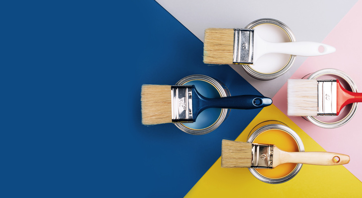
As the festive reds, golds and greens vacate our homes until next year, the January blues often come to take their place. If stripping back all your Christmas decor has left you feeling in a bit of a rut, it could be time to inject some more colour back into your home. So, we’ve chosen some of the most coveted colour schemes to brighten things up again this January…
Go green
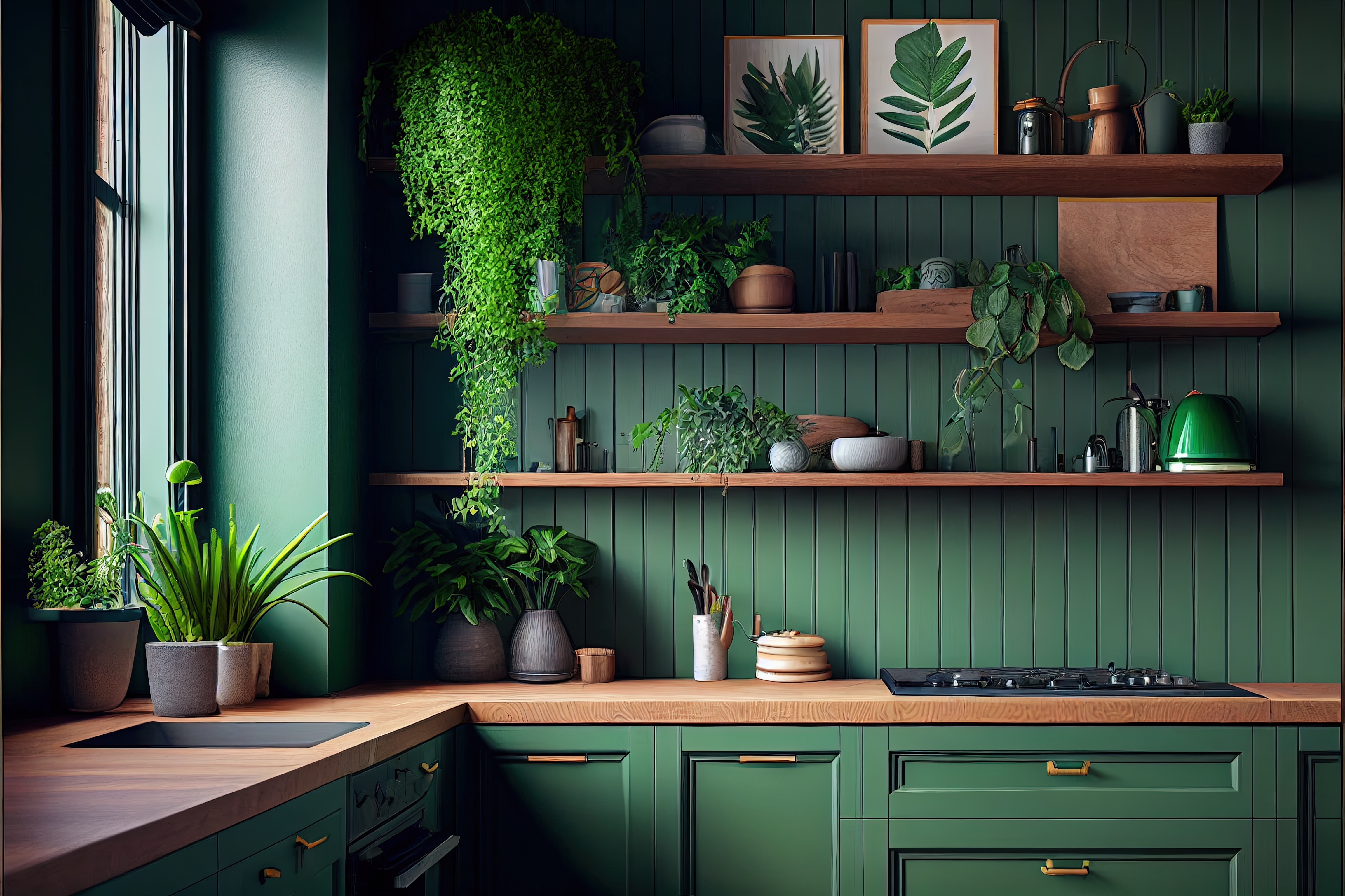
If you’re a fan of verdant hues and bringing nature indoors, there are plenty of colours that harmonise with green to round out a fresh colour scheme for your home. For the base colour, you can set a zesty and energetic ambience with lime green, cool things down with playful sage and mint, or amp up the sophistication with luxurious emerald tones.
With green being at the centre of the colour wheel, you can pair it with either warm or cool tones depending on your taste. For a New Year’s revamp, we recommend the perfect coupling of green and yellow for a balanced and calming space using two colours from the same family. For a modern approach, try soft, tonal shifts in shades rather than harsh contrasts to maintain a restful yet vibrant aesthetic.
Warm reds
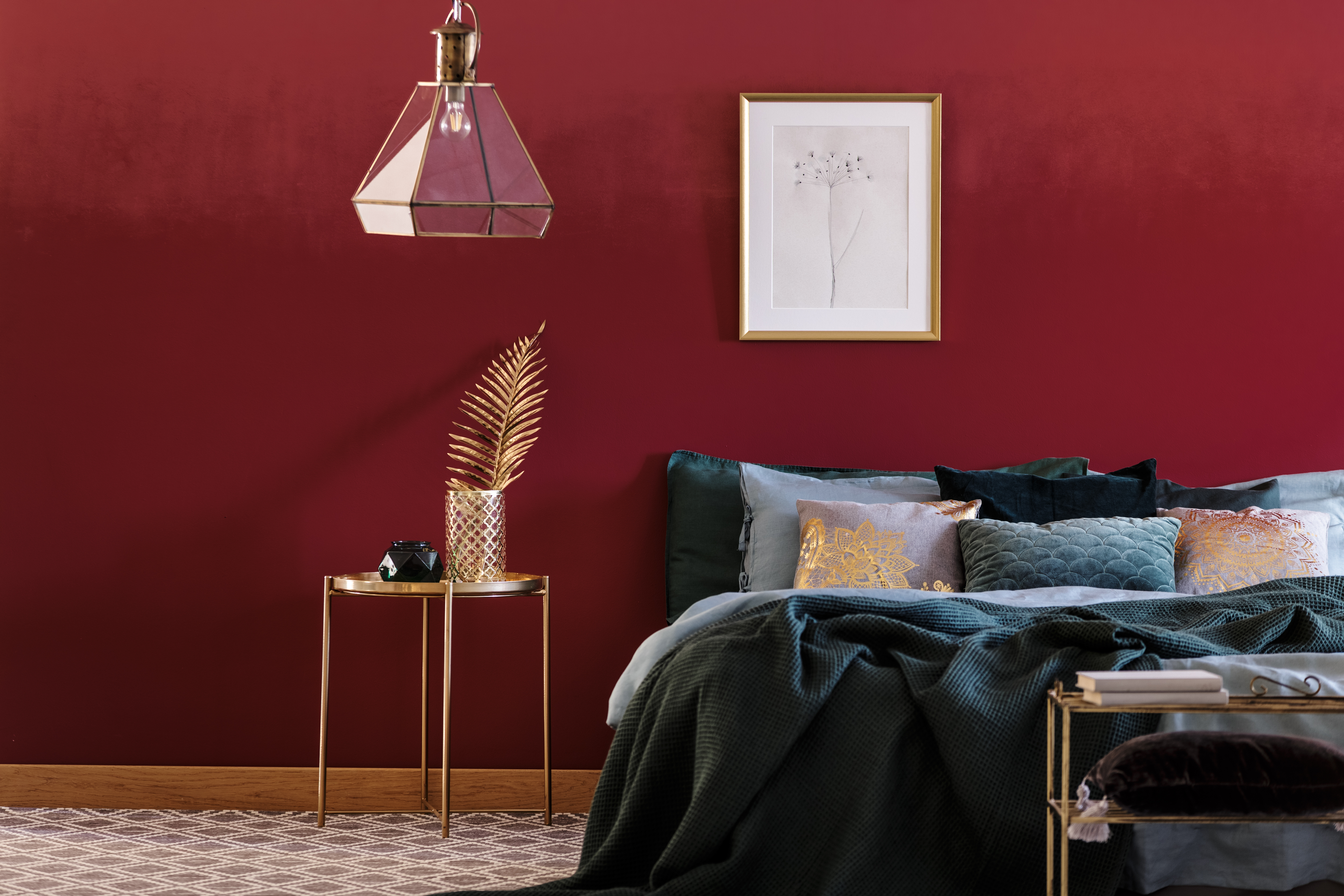
Lively, warm and full of depth, red is a powerful colour that can bring your interior to life. If you’re looking for a bold statement, indulgent strokes of maroon or daring touches of invigorating scarlet are the perfect way to bring that ‘wow’ factor into your living space.
Tone wise, showstopping scarlet is one of the most head-turning shades and therefore contrasts most brilliantly against neutral tones like crisp white. But if you’re looking for a softer colour scheme in your home, why not opt for earthier hues like terracotta and rust?
Punchy pastels
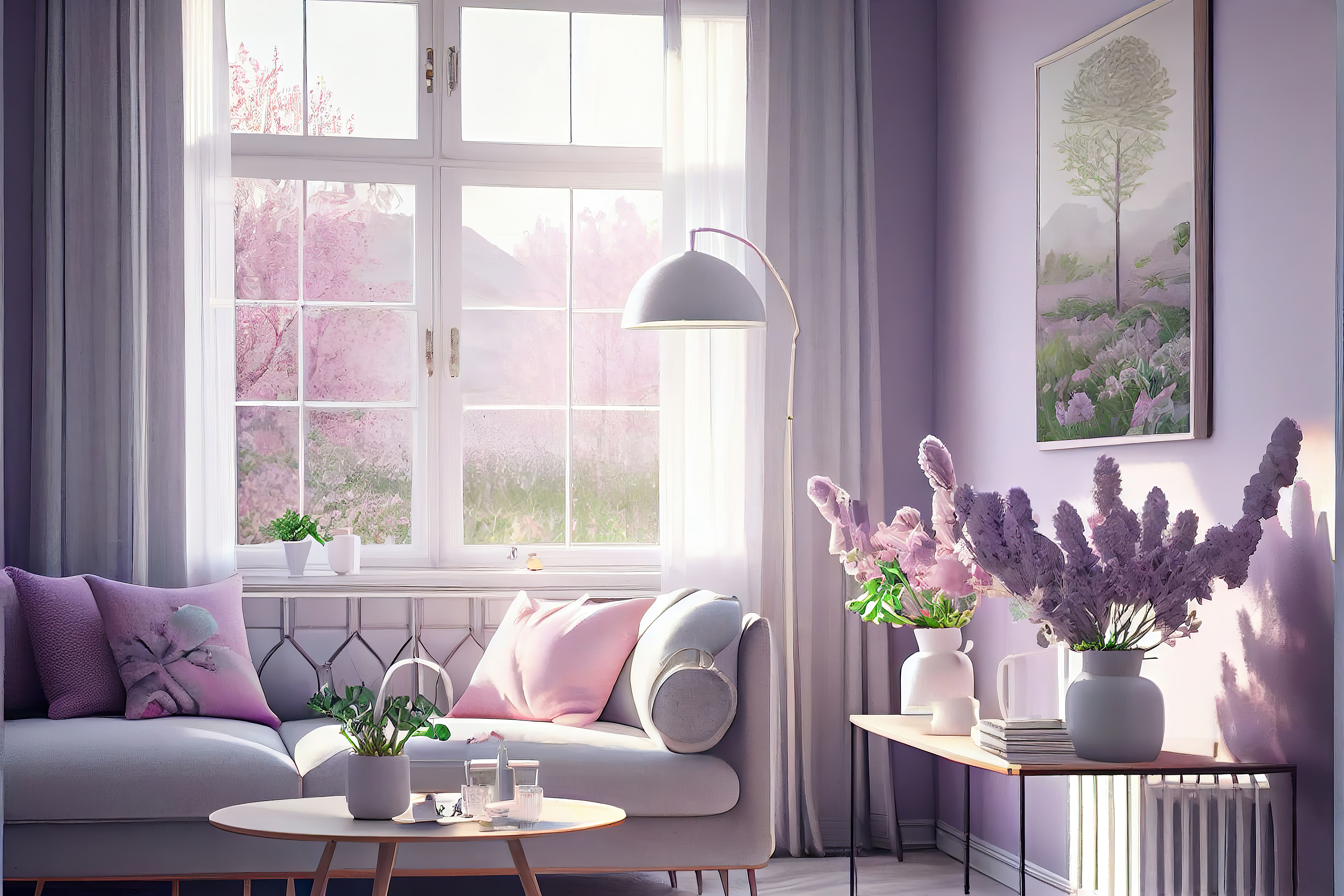
The strange paradox about pastels is that these soft and muted tones of mint, lemon and duck egg can make a space more striking and vibrant. A pastel colour scheme can range from cute and quirky to elegant and sophisticated. Whether your tastes are grounded in classic country style or something more modern and chic, you can make these versatile colours work well for your home with a balanced colour scheme.
Pastel colours pair beautifully with all kinds of hues, from all shades of grey to neutral white. A combination of dusty rose pink and taupe grey even becomes a classic in its own right, and you can create a winning combination of your own using this variety of soft colours.
Pops of primaries
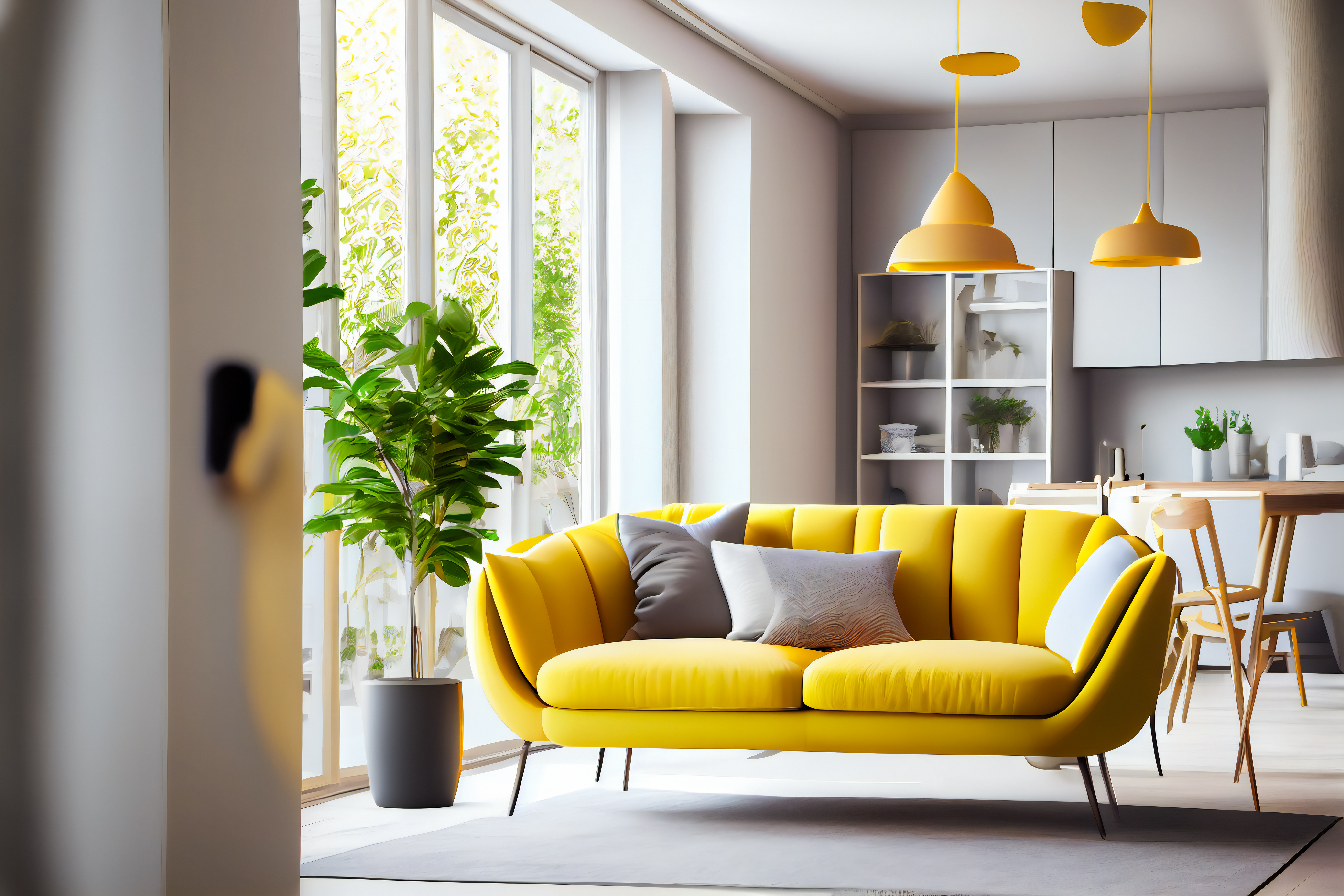
Primary colours might seem daunting, but for those with a keen eye for design, styling your home using primary colours simply takes a little extra planning and precision for a truly impactful effect. The colour wheel can help you when coordinating primary colours with other colours, as you can balance out the space with tones that complement each other.
If you plan on brightening up your home using primaries – and their derivations – bear in mind that cool colours recede, which means they partner well with bright spaces that you want to feel calm and spacious. On the other hand, warmer colours advance, which is why they’re ideal for creating a cosy yet lively space. Because of this, it’s best to pair primary colours with shades from the same family to create a sense of harmony.
Contact us
If you’re looking to sell your home, contact your local Guild Member today.

